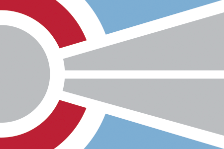
From Lighthouse to Flagpole
I’m a big fan of flags. When I lived in DC the District’s flag made me feel connected and part of something larger, something whole. Simple, recognizable, easy to reproduce in any media and it scales! I loved to look at flags even at a young age, and remember my third-grade self sifting through a card pack of world flags and matching them to their corresponding countries on one of those old pull-down maps. Public education can influence design!
I’ve been in design in one form or another for over 20 years now…last month I was finally asked to design my first flag. Thrill and panic rippled from toes to nose. What if I can’t simply enough? What if the client hates my ideas? Or worse, what if the client picks the wrong design?
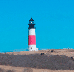
My client, a small Nantucket-based conservation organization, owns an island icon, Sankaty Lighthouse in the town of ‘Sconset. The purpose of the flag is to display ‘Sconset pride, so the design had to be related to the lighthouse and the area. Also, my client hoped to sell flag-related items to raise funds. So that means producing actual flags, stickers and many other items. Time to do some flag research!
While I know the elements of good flag design, it always helps to have someone else spell it out for you (thank you, thank you to 99% Invisible for the Vexillionaire episode):
1. Keep it simple
2. Use meaningful symbolism
3. Use two to three basic colors
4. No lettering or seals of any kind.
5. Be distinctive
6. Work small, one by one and a half inches.
These simple rules make for great flags. No matter what the client says, never let them talk you into adding a seal or any lettering, NEVER. Our own stars and stripes is a testament that. Educating the client is a huge part of design, and any art form really. Informed clients make better design decisions.
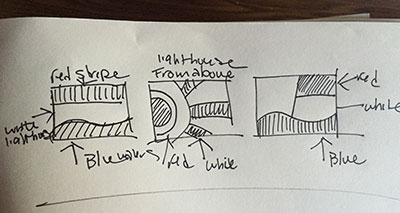
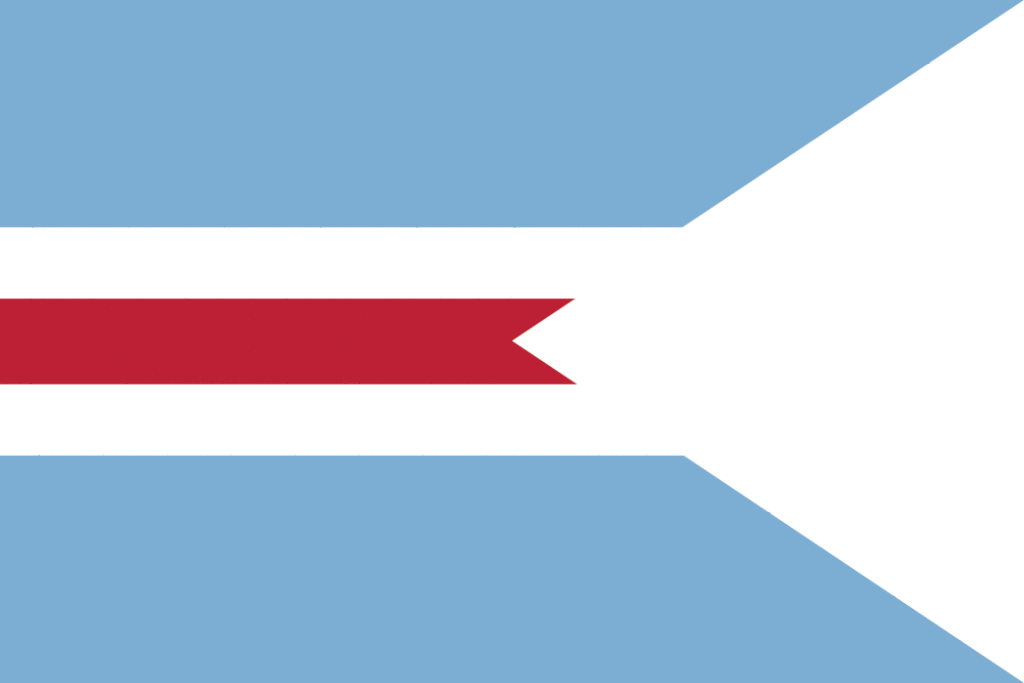
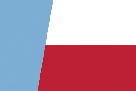
I got to work making sketches and eventually had over 26 designs. I decided to use the lighthouse red with my client’s corporate color, a blue-gray/Hamilton blue. I weeded through them and pared down each concept, so it was simple, easy to see from a distance and scalable. Here’s a slideshow of the results. Can you guess which one the client picked??

