
Reining in the Rainbow:
Working with Limited Color
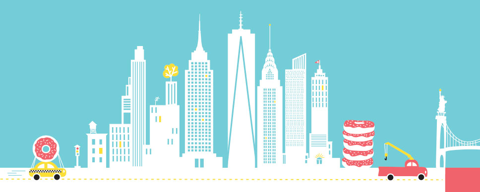
An example of an illustration I created using a limited color palette.
I remember years ago, sitting in a design meeting, one of my first, listening to the client effuse and expell about color:
“The logo…it needs to be BIG and really COLORFUL!”
“Well do you have a corporate color we can start with?”
“No, you’re not getting me. It should be so colorful I can HEAR it.”
“Well, I think I can come up with a harmonious palette that might communicate…”
“No. I want an entire peacock, and needs to be really, really big!”
Scalability discussion aside, I should have packed up my swatches and headed for the nearest neutral. In my experience a meeting like that can only be soothed away by bathing in Pantone Warm Gray 3.
Then the client pulled out an elephant-ear-sized color proof:
“This is what the first designer came up with. I liked it, but it’s got too much blue.”
Too much blue??? What client says that ? Blue, the universal neutral. The Switzerland of Color.
“I like the overall effect, but I really wanted something more explosive.”
With that she held up the proof. Before me was a discordant, almost hostile, logo for a milquetoast trade show called Springtime in the Park (don’t get me started on that). It was a colossal amorphous mass of cloud-like trees and vaguely arboreal shapes each in a different PMS color. I counted 9 separate Pantone colors before my defense mechanisms sprang into action and dulled the hues by putting me in a state of temporary color blindness. The color equivalent of a medically-induced coma.
Not only were the colors offensive, a rainbow of aquas, dark blues, pink, yellow and orange. By 90s standards, this would have cost some serious green to print (PMS 7494, and lots of it).
Since that fateful meeting I have become a fan of limited color, and in fact, prefer to work with a limited color palette. Curbed color adds uniformity, cohesion and depending on the hues, a nice amount of tension.
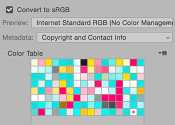
Color table
Limited color doesn’t have to be constraining. This image of the color table from Photoshop’s “Save for web” option breaks down the graphic above into lots of hues and tints that are quite harmonious. I also think that limited color can make a designer work harder, and often times, creating a better design in the end.
It’s easy to think that more color has more impact, but 99% of the time, the opposite is true. If you rein in the rainbow you may find a monotone pot of gold at the end. Perhaps in PMS 123…and lots of it!